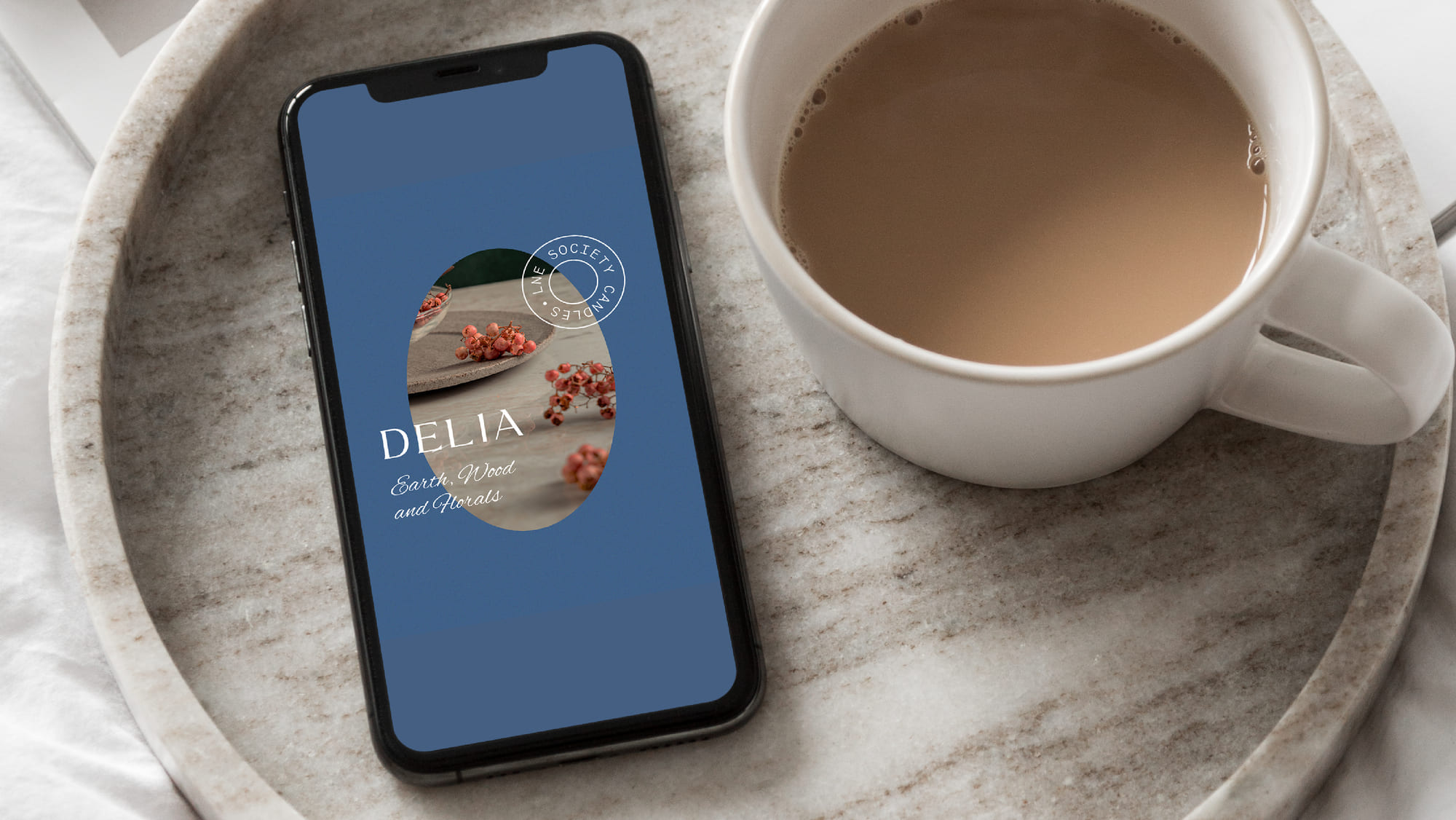
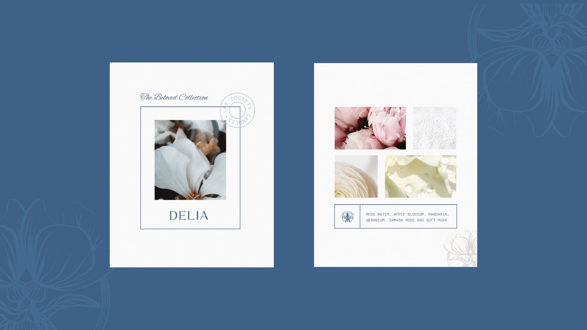
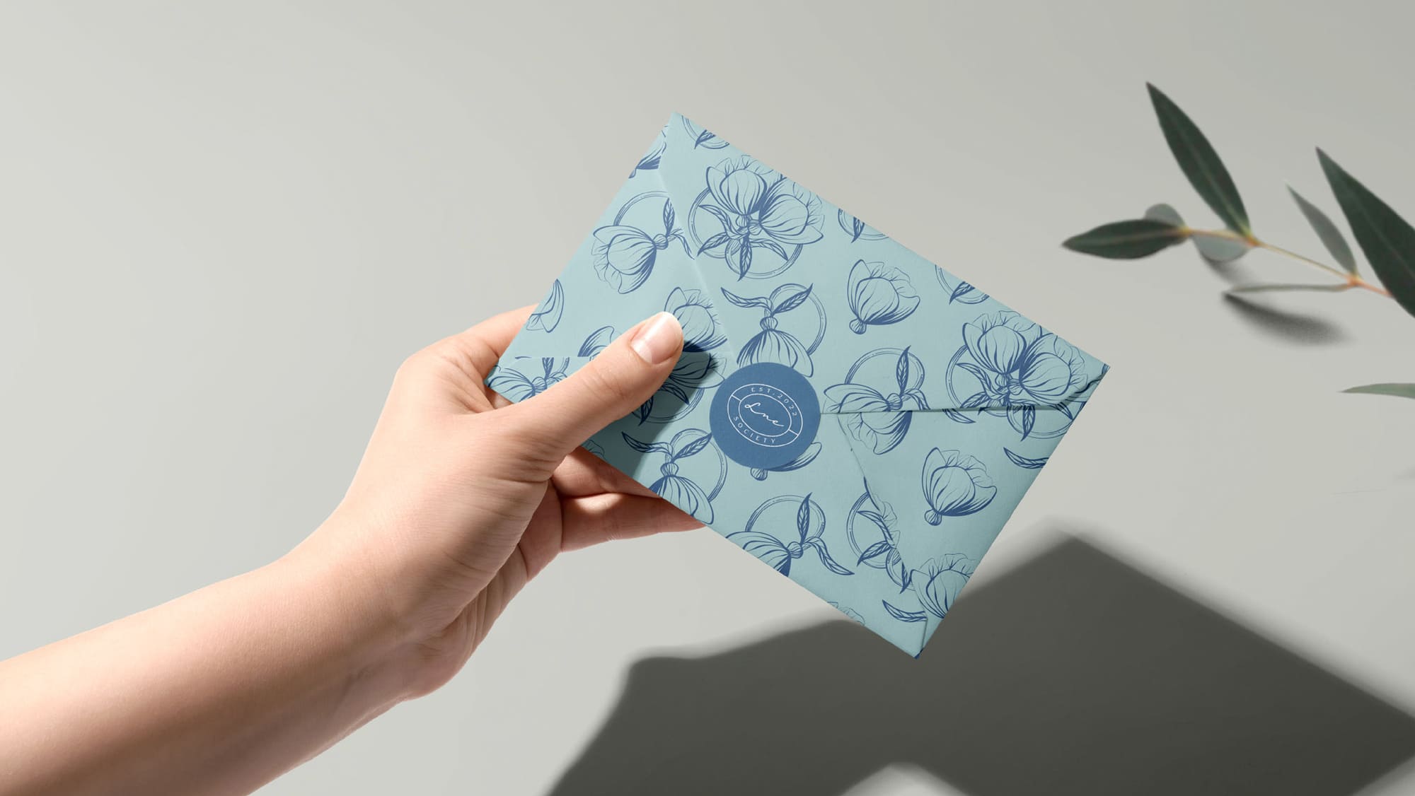
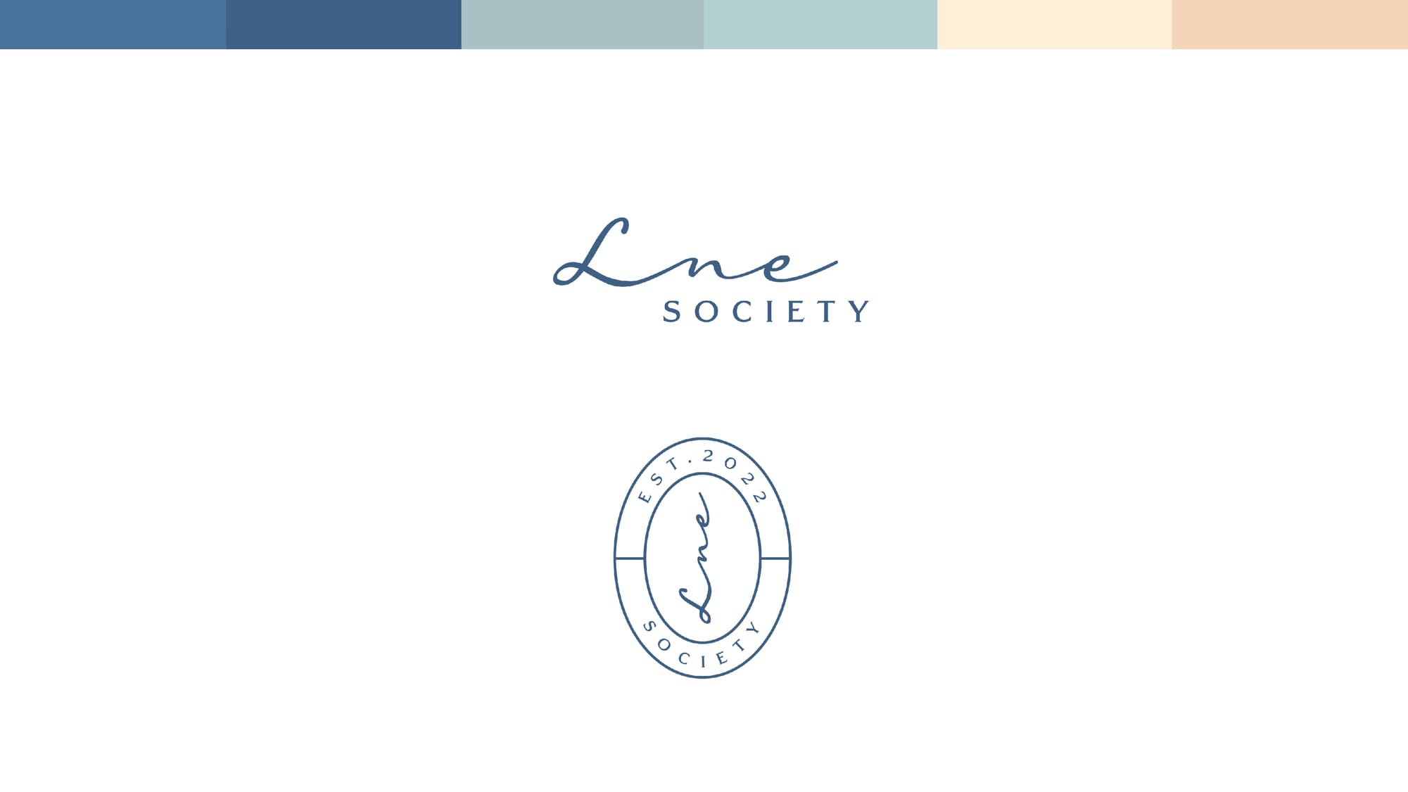
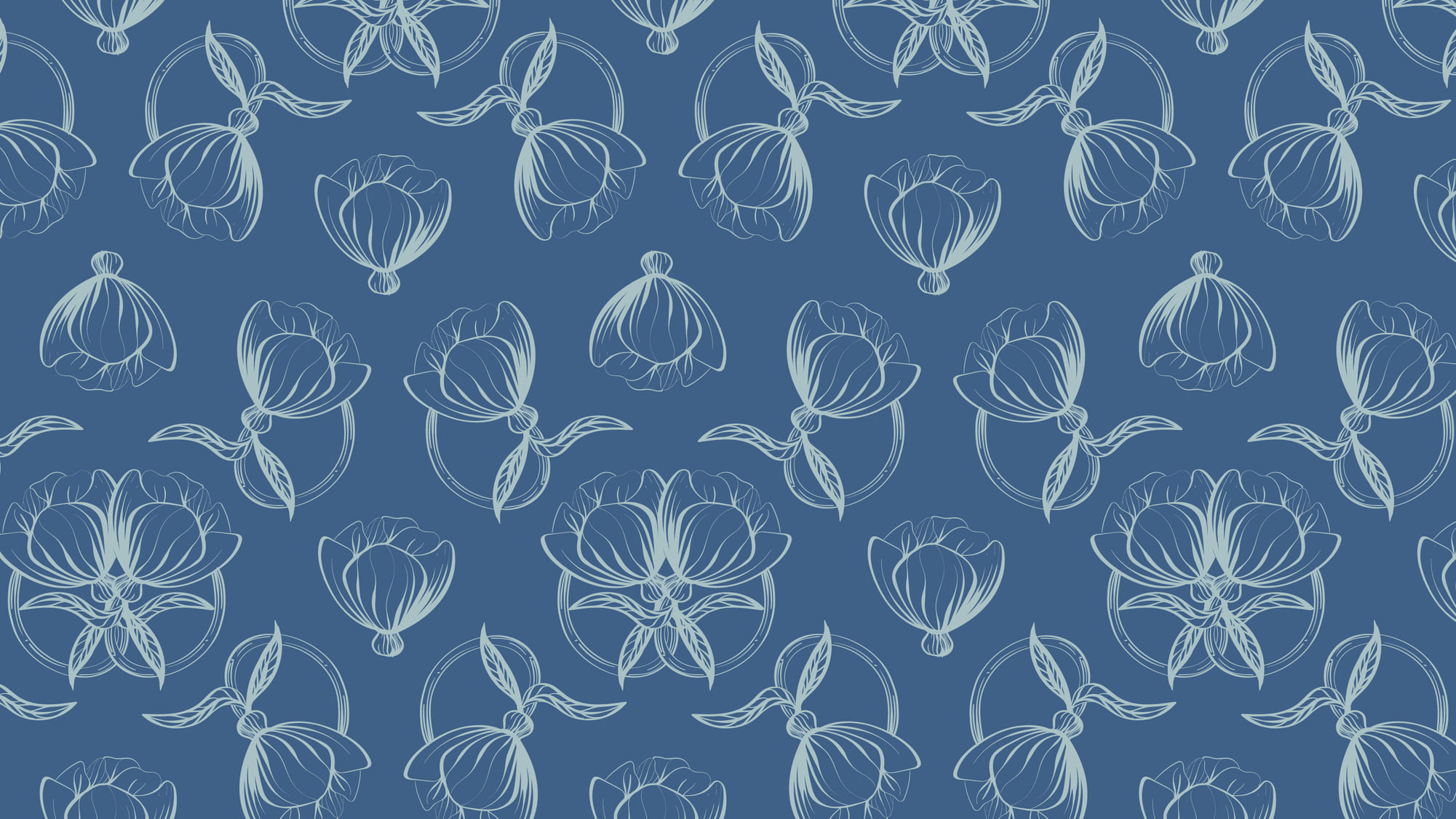
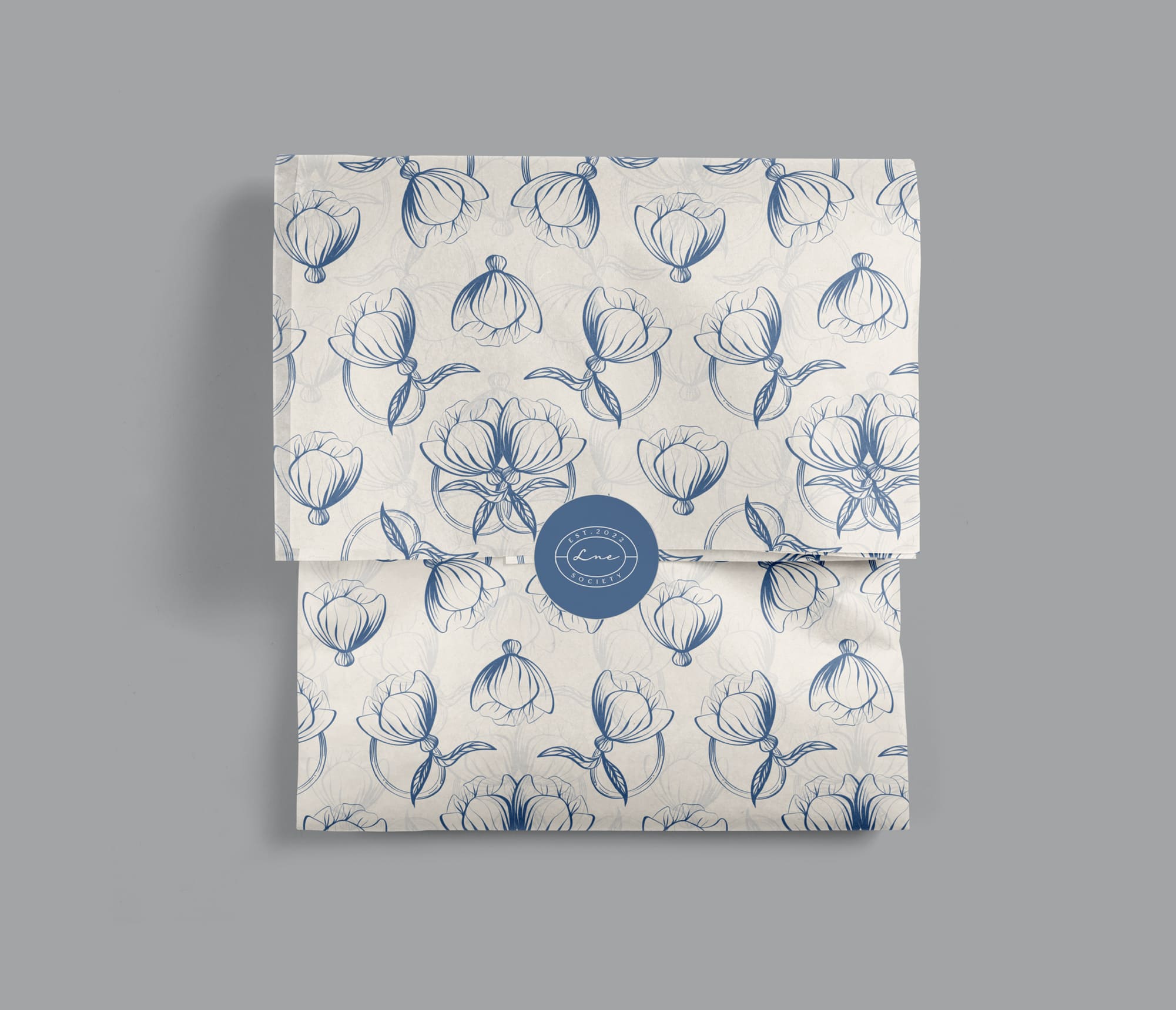
During our discussions with the owner, I proposed a concept for a very simple yet sophisticated brand, primarily centered around the color navy. We chose blue because it’s associated with trust, tradition, and elegance, making it our main color. To add a more feminine touch and connect with our target audience of women, we introduced softer colors like pink and light teal. As an extra detail, I hand-drew a double flower, symbolizing the brand’s vision that “you’ll never be alone as a woman,” emphasizing the supportive aspect of the brand.