Citrus Tree
Eco candles brand refresh
The challenge
Citrus Tree is an ethical, eco candles brand. They wanted their style to feel cheerful and welcoming, but also more polished. The logo they had wasn’t very versatile, and the colours didn’t stand out much. The fonts they chose were too playful for the kind of people they wanted to attract. Their main goal was to make a new logo and improve how their brand looks.
How I helped
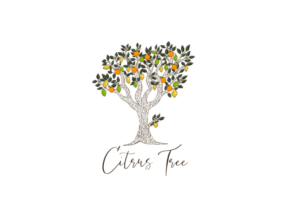
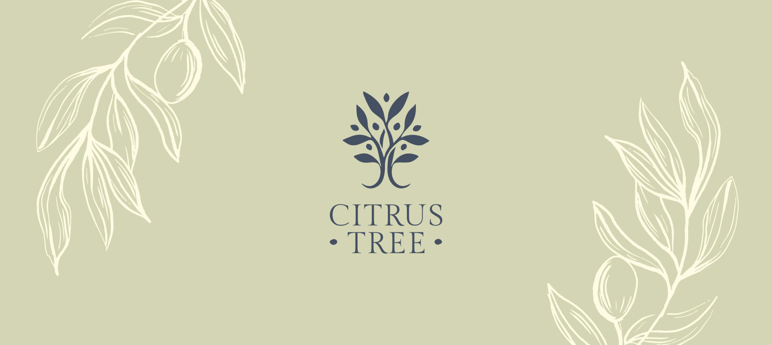
During our discussions, we decided to stick with the lemon tree as the logo symbol. I believe this choice brings forth cheerful feelings and also connects with the brand’s core scents. This concept aligns well with the people Citrus Tree wants to attract.
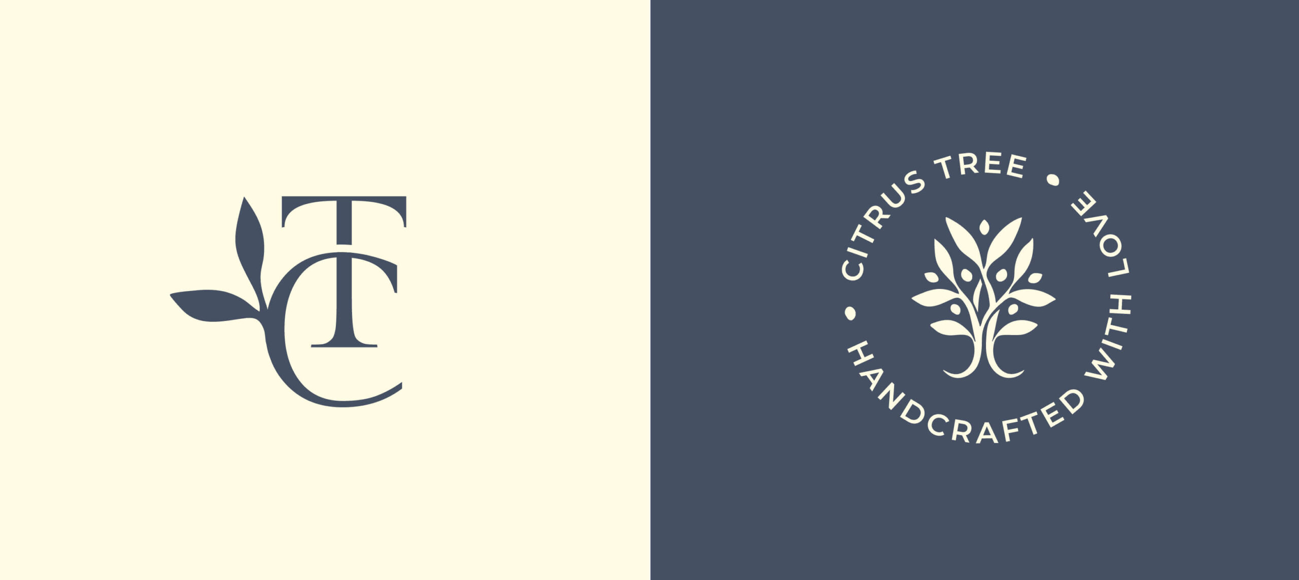
The logo design features a simplified hand-drawn tree that leans toward elegance. Compared to the old logo, it’s much more versatile and can be used in many different ways.
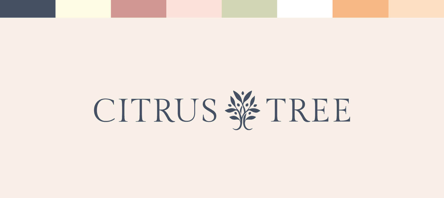
As I worked on the colors, I maintained the overall theme of a vibrant and bright brand. However, I introduced a deeper shade of grayish-navy to add an element of elegance when necessary.
For the fonts, I combined an elegant serif font for the headings with a simpler one for paragraphs. This strikes a good balance between lively colors and sophisticated fonts.
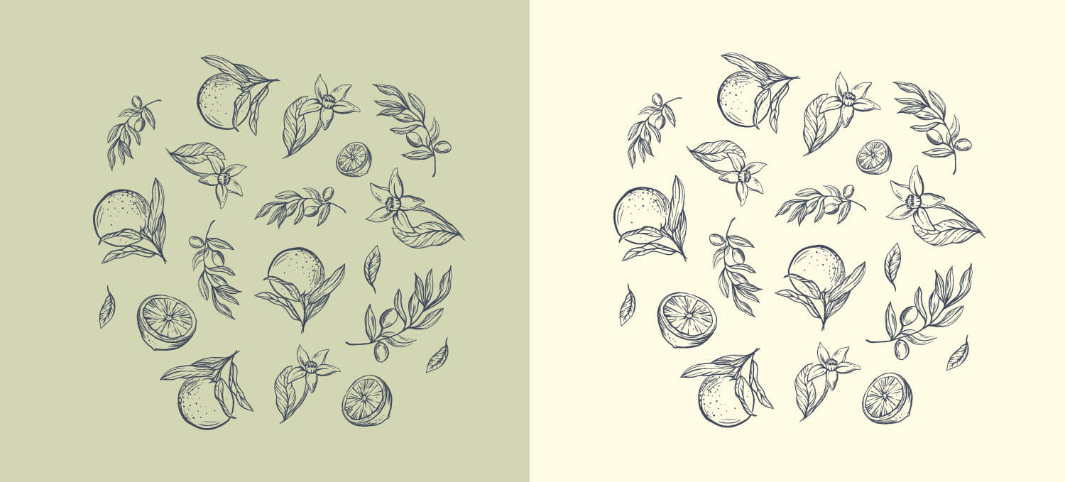
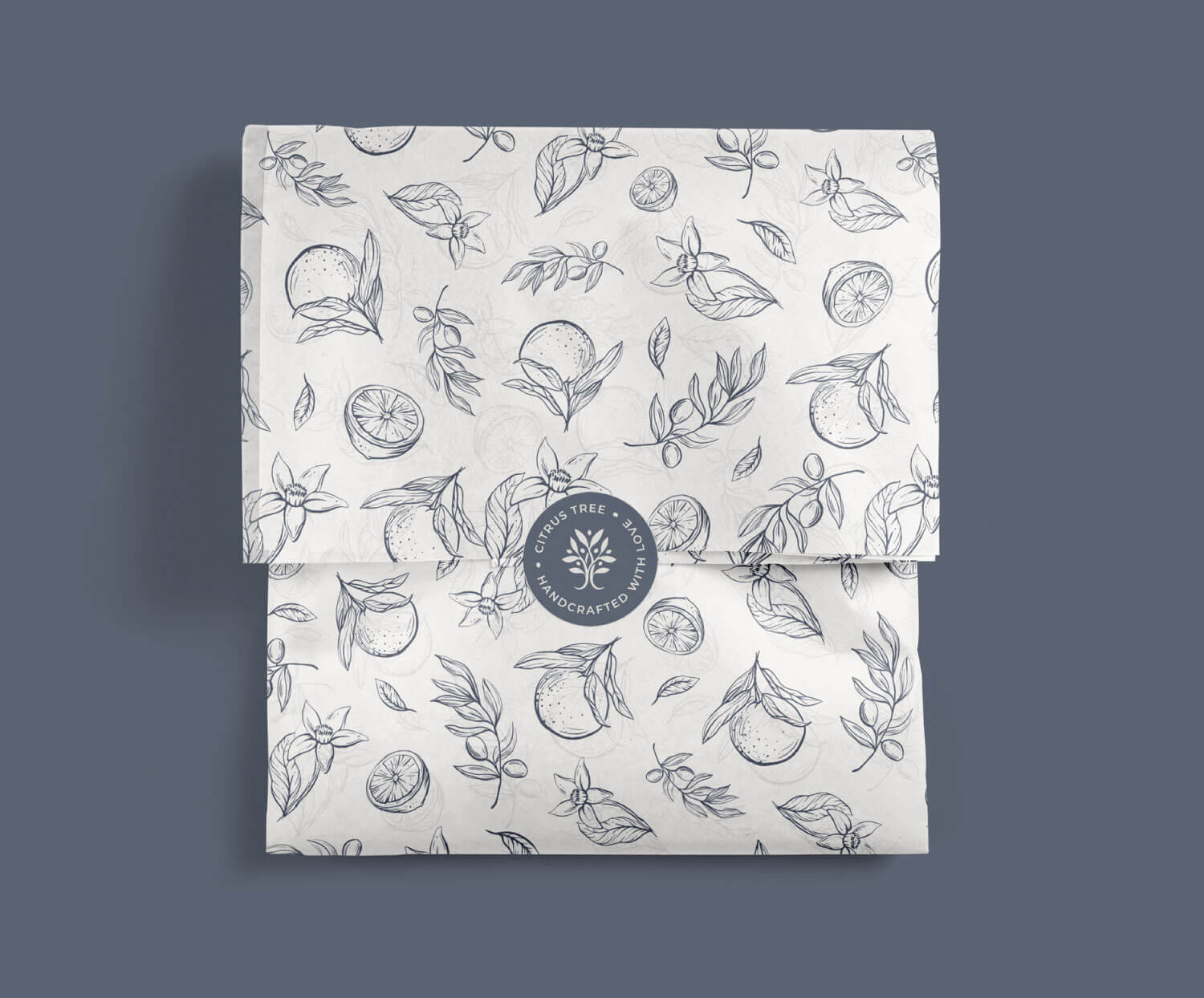
Additionally, I crafted hand-drawn botanical illustrations to further echo the brand’s identity. These illustrations depict lemons, oranges, and vanilla flowers. They are all hand-drawn and can be used by the brand to enhance recognition.
The result
Very flexible, professional logo design
Eye-catching visual appearance
Consistent brand
Attractive to premium clients
Client’s feedback
“I’m SO glad I found Joanna to help re-create my logo and as well as illustrations. She is not only helpful but also VERY professional. She is super responsive, which I admire when dealing with other businesses. She also listened and understood my business needs while also providing expert advice. I would highly recommend her and will definitely be working with her again for future branding strategies.”
