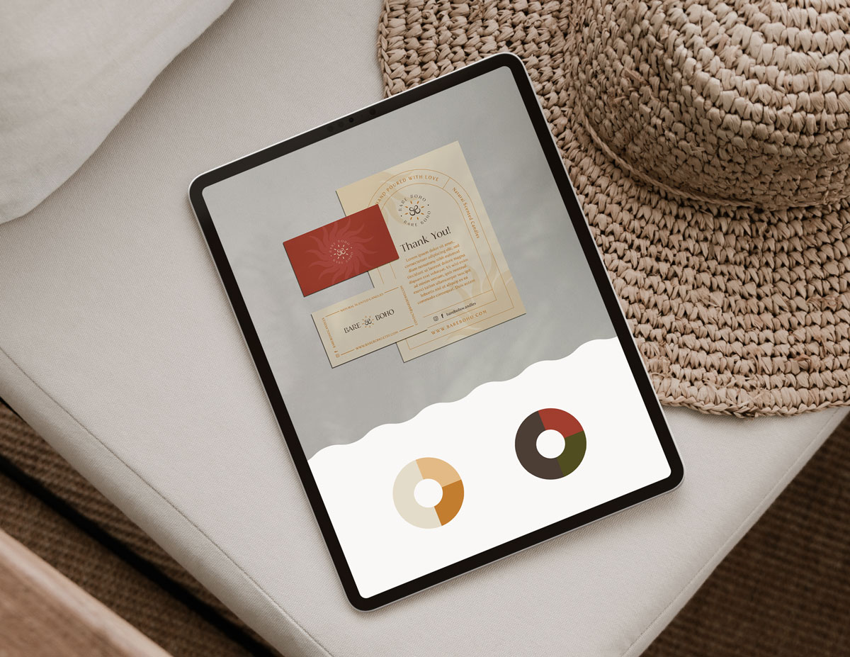
We talked about emotions related to their products, their values and who they see as potential clients. Using the brand strategy questionnaire and competition research, I helped Bare Boho to clarify their strategy. I created mood boards with different brand directions and they chose one with earthy colours and a joyful vibe.
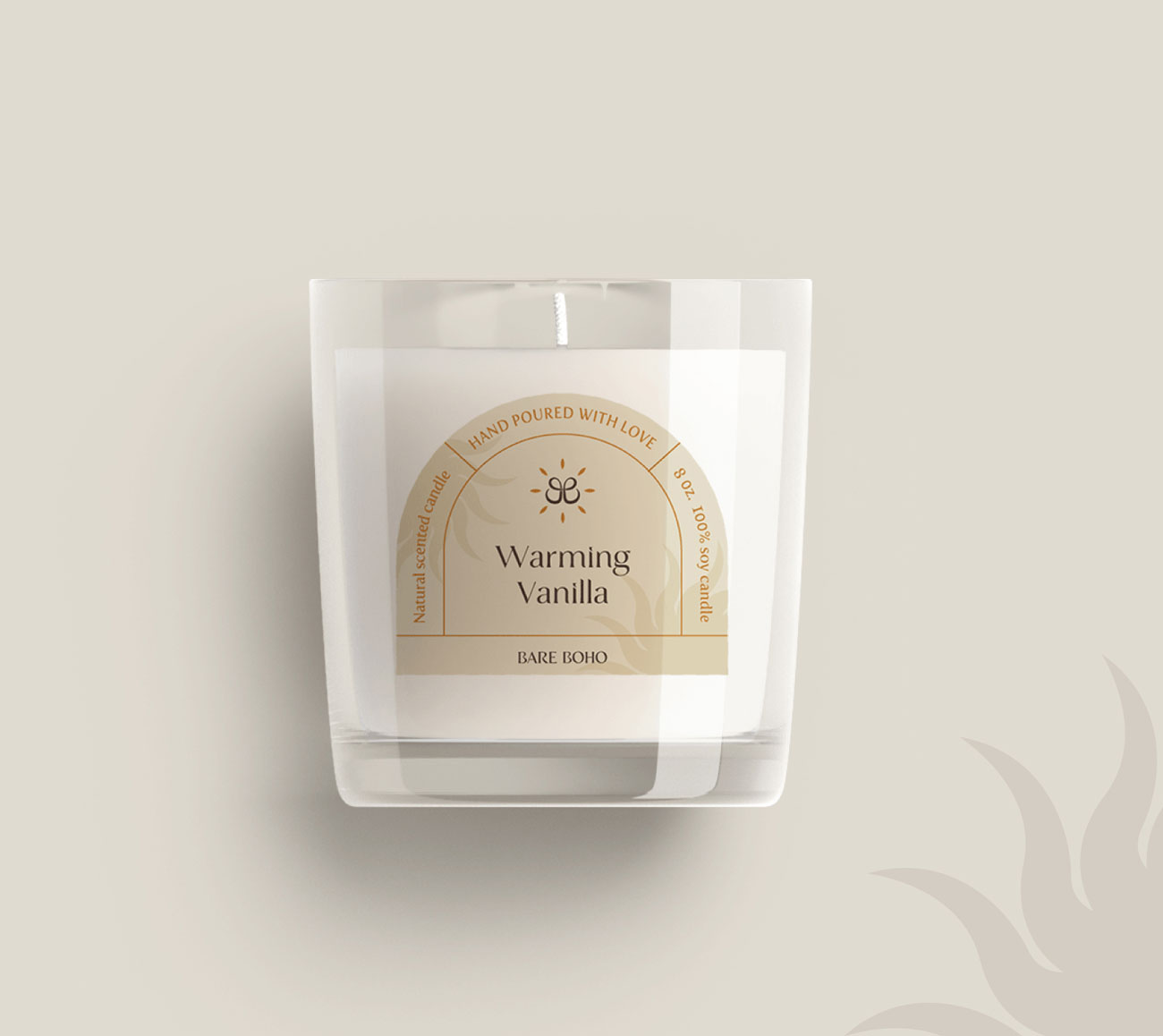
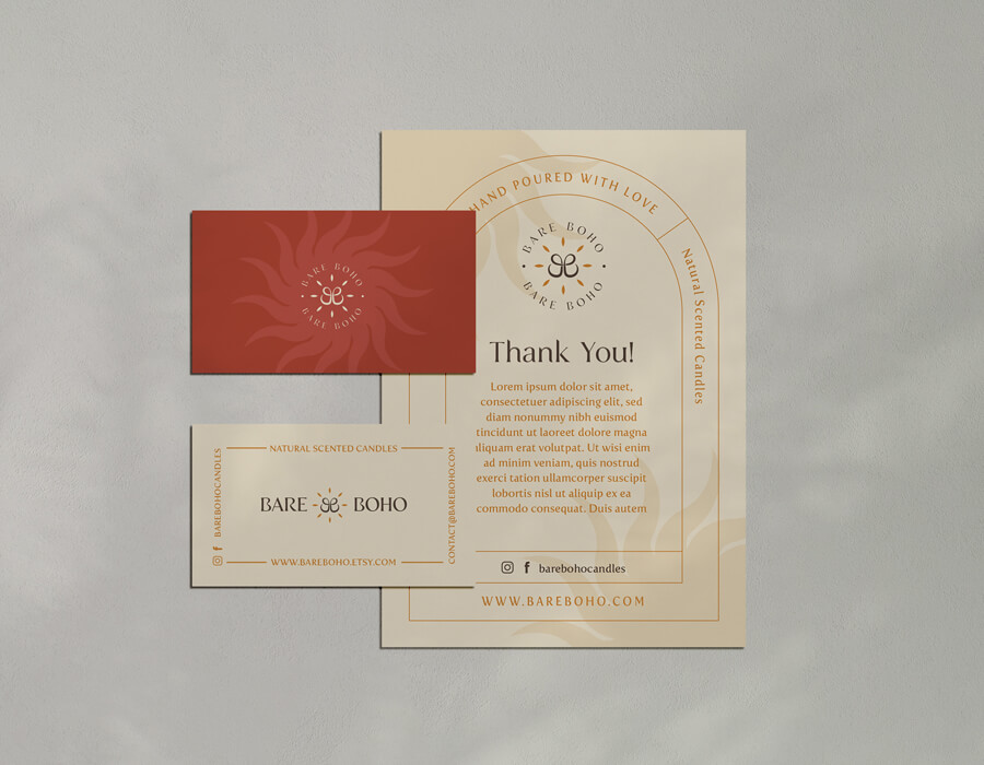
The warm, earthy colours of the Bare Boho brand identity express joy and balance. The logo is based on a monogram of two letter ‘B’s and the sun symbol appears as a key
visual. The overall brand impression is cosy, but elegant. The brand strategy focuses on sharing the positive things in life. It’s about finding balance.