Architect Branding with Purpose: A Distinct Identity
Client: Thiede Architects
The challenge
Creating unique branding for architects that feels both professional and approachable.
Thiede Architects is a thoughtful architecture studio with a strong focus on environmentally-conscious design. As they began shifting their strategy to better serve individuals seeking sustainable solutions, it became clear that their branding needed to evolve. The studio wanted to move away from a cold, corporate image and adopt a more welcoming visual identity—while still maintaining credibility within the field.
They also hoped to break free from the typical architecture studio colour palette, opting instead for a brand identity that reflected their values and stood out in a crowded market.
How I helped
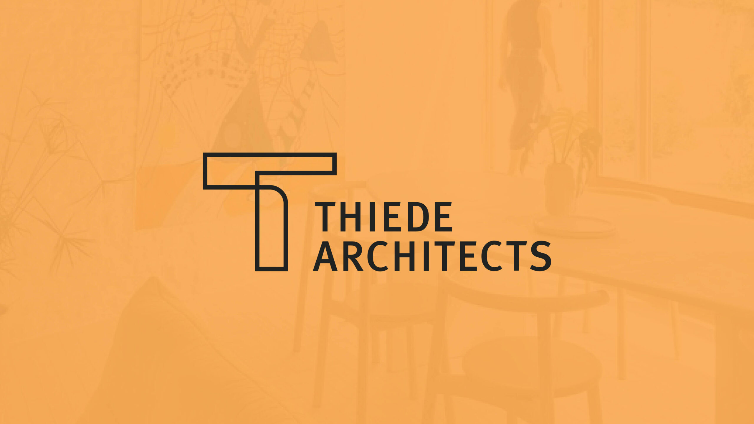
This rebrand was built on clarity, intentionality, and depth—core principles of sustainable branding. We explored how to express their personality through an identity that balances warmth with structure, aiming for an architect logo that feels both grounded and original.
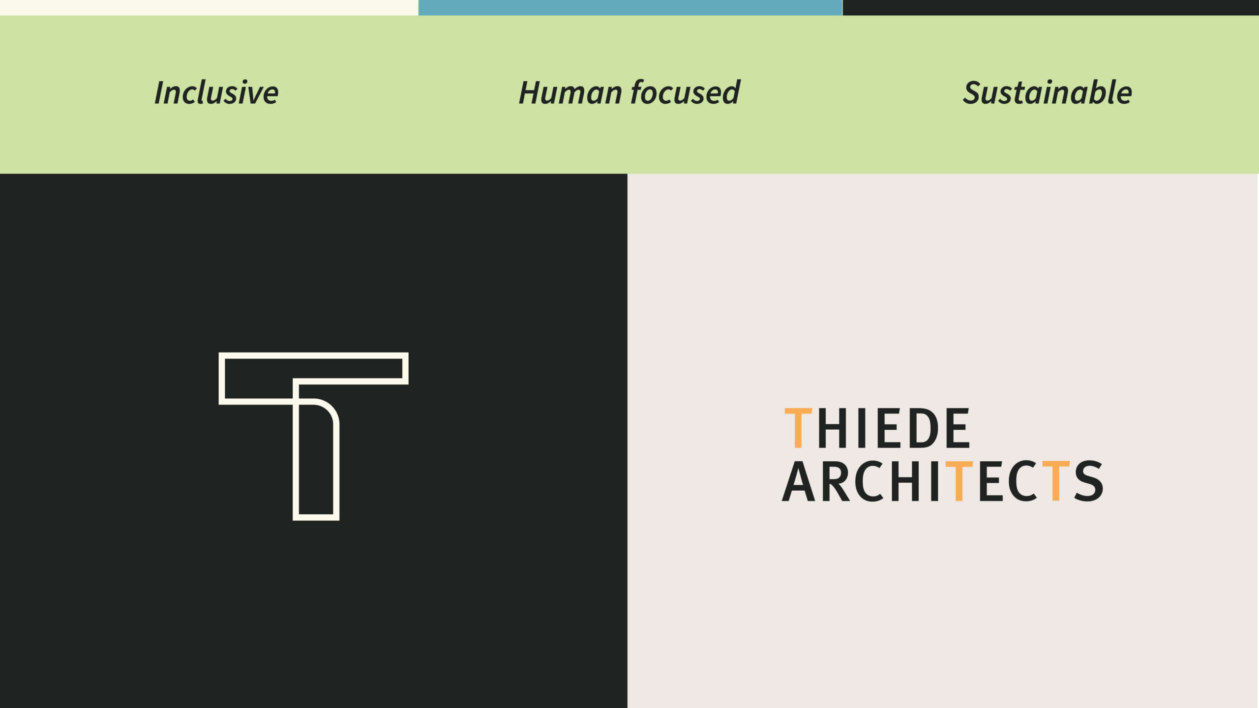
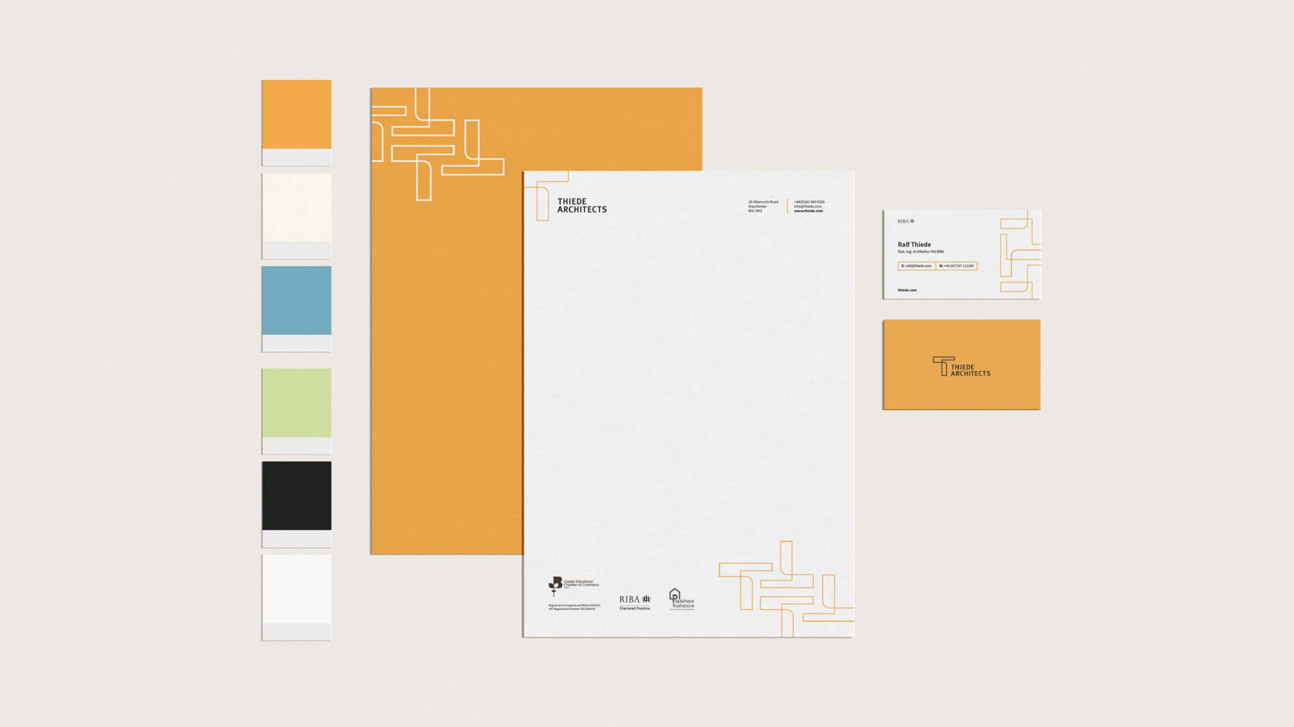
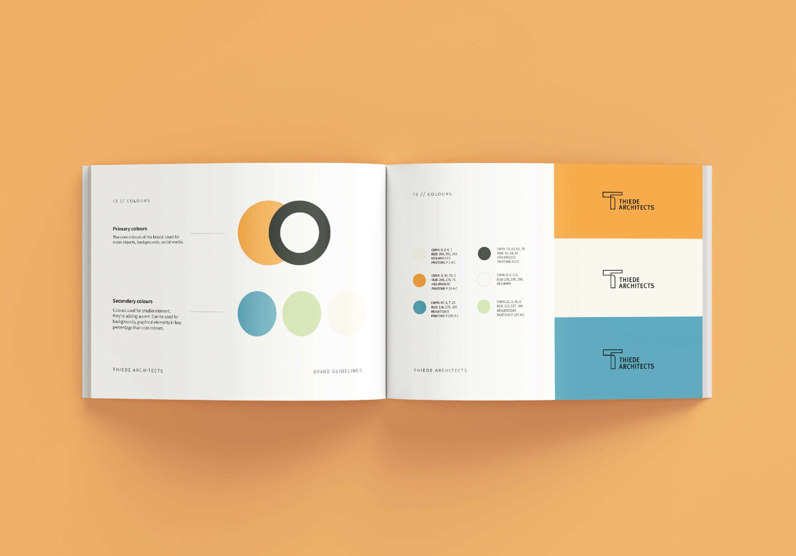
Drawing from the founder’s German heritage and design education, the visual language took inspiration from the Bauhaus movement—celebrating minimalism, geometry, and strong typographic traditions. These timeless elements were contrasted with a vibrant and friendly colour palette: soft greens and blues to represent their eco-conscious ethos, with a pop of yellow to convey optimism and approachability.
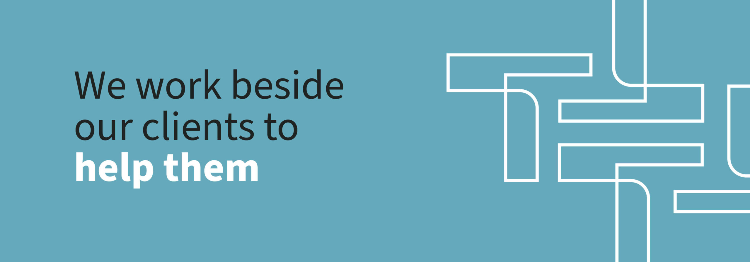
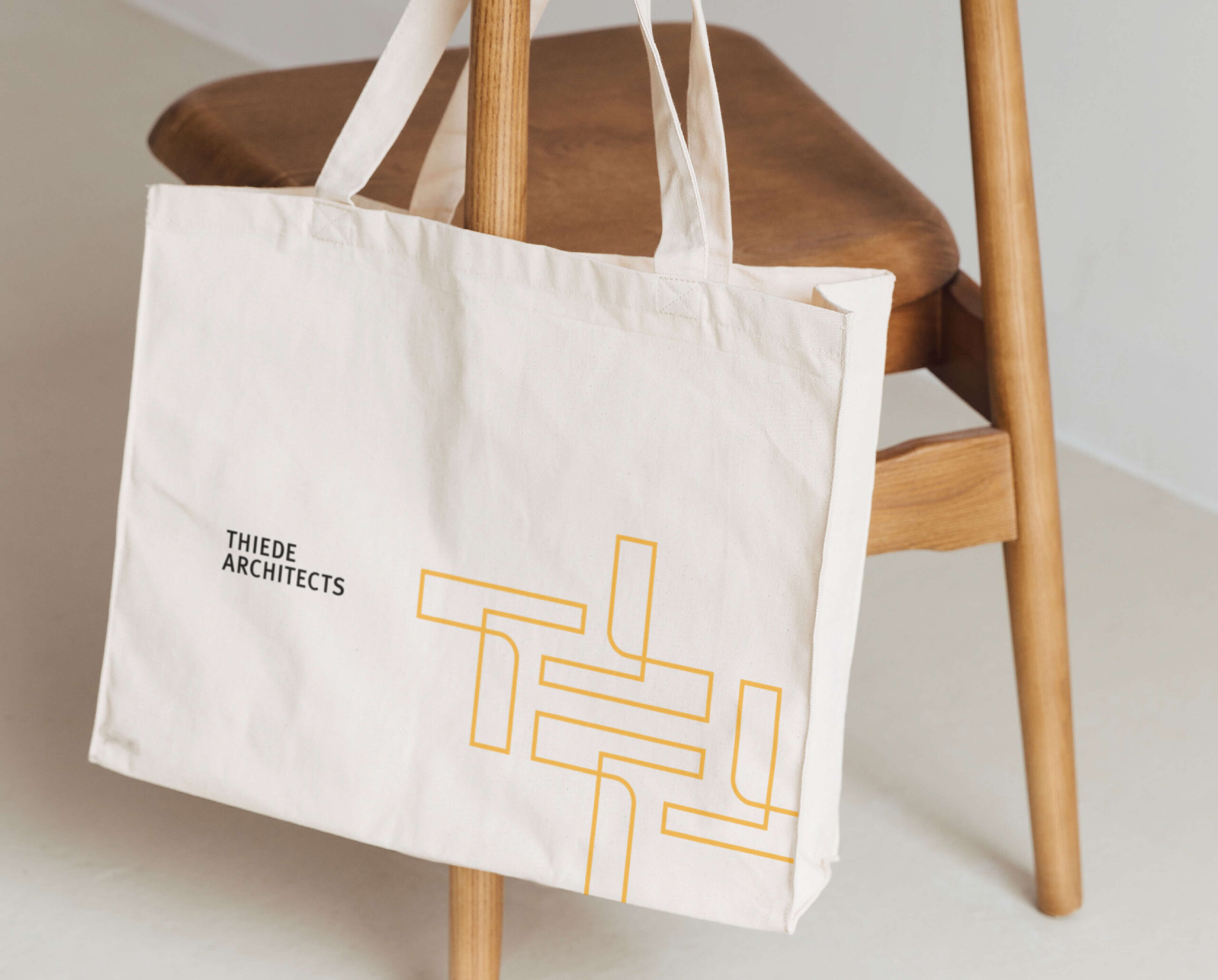
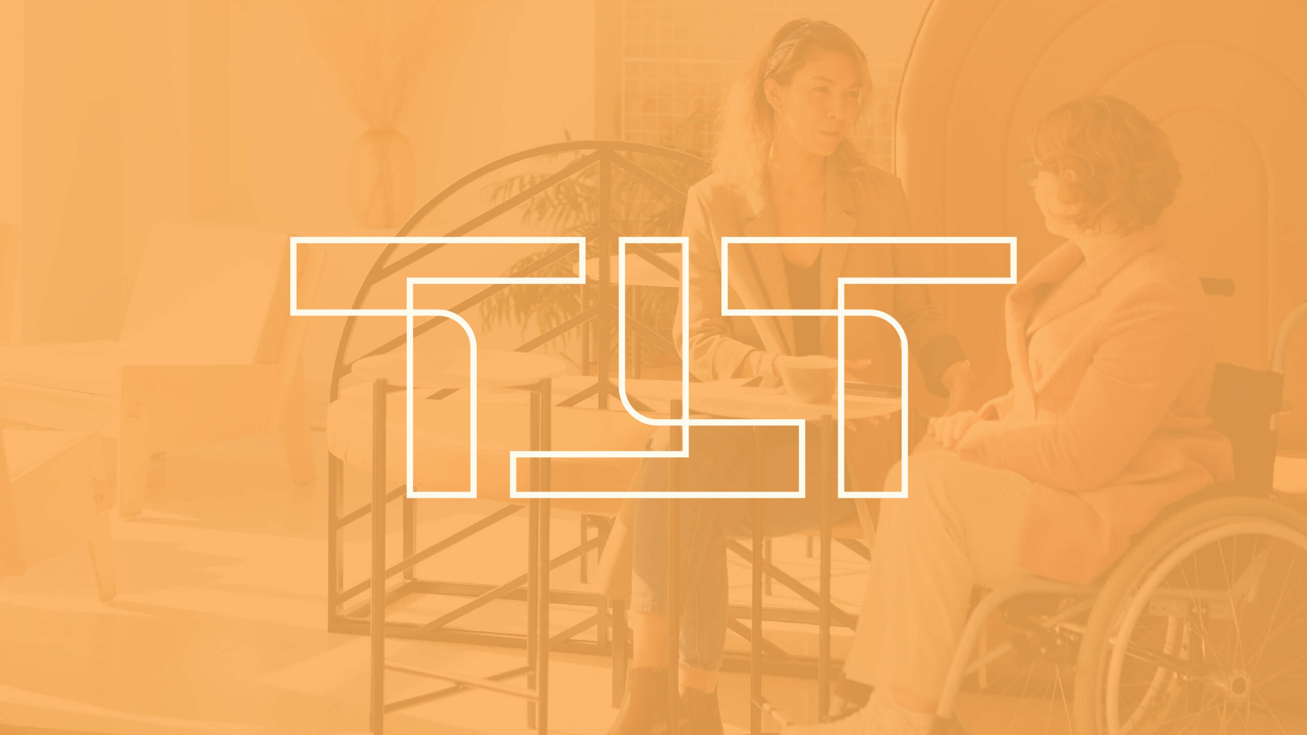
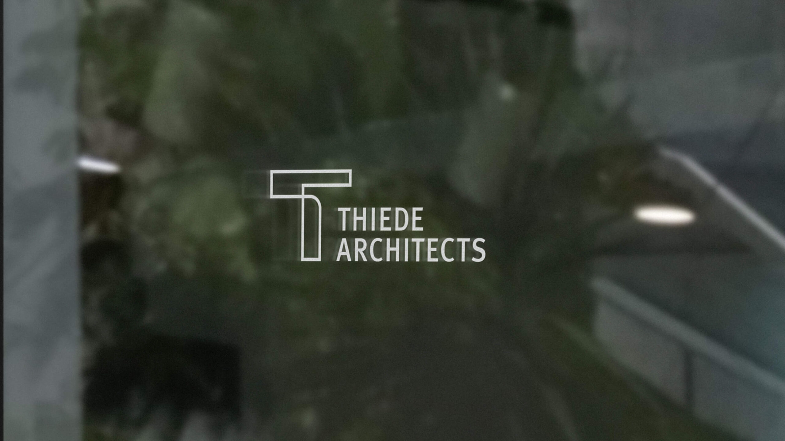
A custom monogram was created to add refinement and structure. This became the foundation of a flexible brand asset that could be used across various materials.

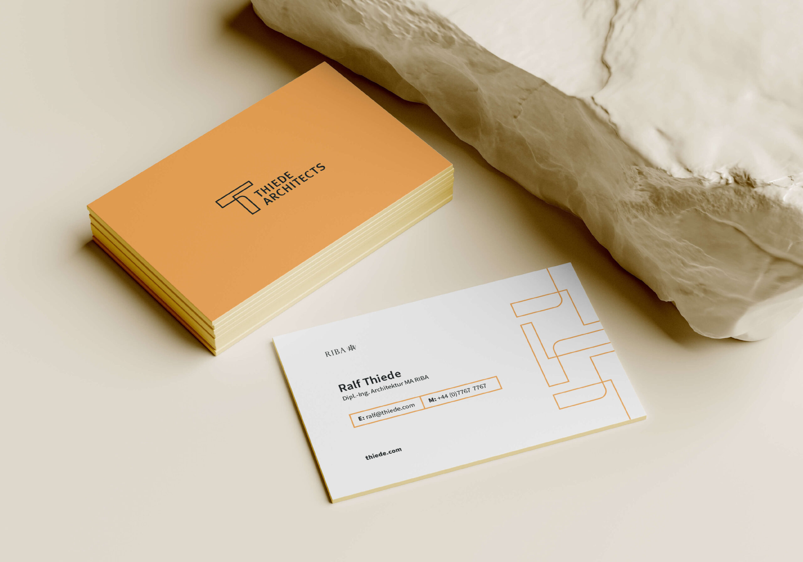
The result
- A professional yet welcoming logo for an architecture studio
- A colour palette that reflects the studio’s sustainable values
- A geometric monogram, inspired by Bauhaus principles
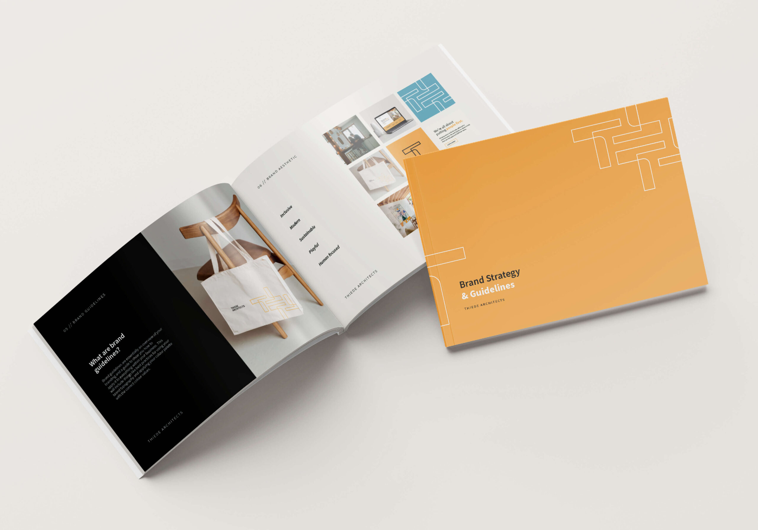
- Clear brand guidelines to ensure consistency across all touchpoints
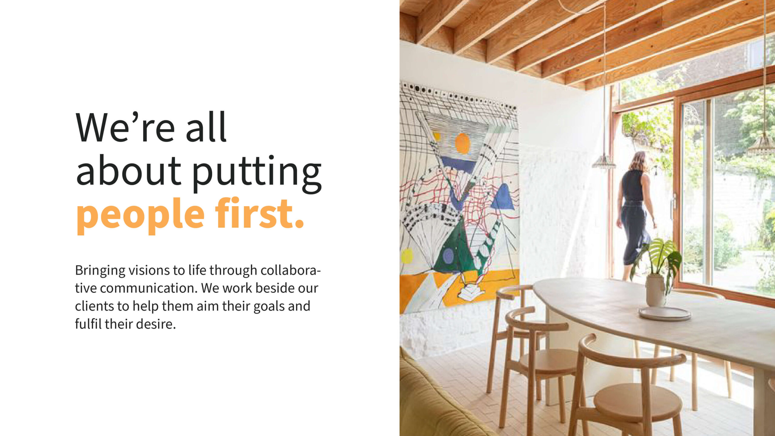
- A strategy-led identity that speaks to both professionalism and warmth
The outcome is a confident and cohesive visual identity—modern, memorable, and aligned with the studio’s mission. The rebrand has positioned Thiede Architects as a practice that not only delivers exceptional design but also values human connection and environmental responsibility
