Logo or logotype?
Sometimes I receive questions about what is a logo design? What the logotype is? While in discussions with other designers I would keep my ‘work’ language more formal, here, I will explain it in the easiest possible way. This is the first part of the article and it’s about logo types.
Logo, Logotype, Emblem where is a difference?
First group of the terms are words around logo design. A lot of terms are used alternately, but sometimes incorrectly.
Logo
Logo is a graphical representation of a brand, company. It’s a simplified and stylized graphic. It includes typography and illustrated symbol. The logo has a few types: monogram logo, typographical logo (logotype), emblem, signature or a mark. The logo is not an illustration. Is more an essence of what would you like to show to your audience, what will make you recognizable and why. The logo has 2 core elements: typography and a mark/symbol. ‘Fox + Iron’ is a typography part and fox drawing is a symbol.
Submark – it’s a variation used when the main logo don’t fit the medium. It’s usually a simplified version of the logo.
Logotype
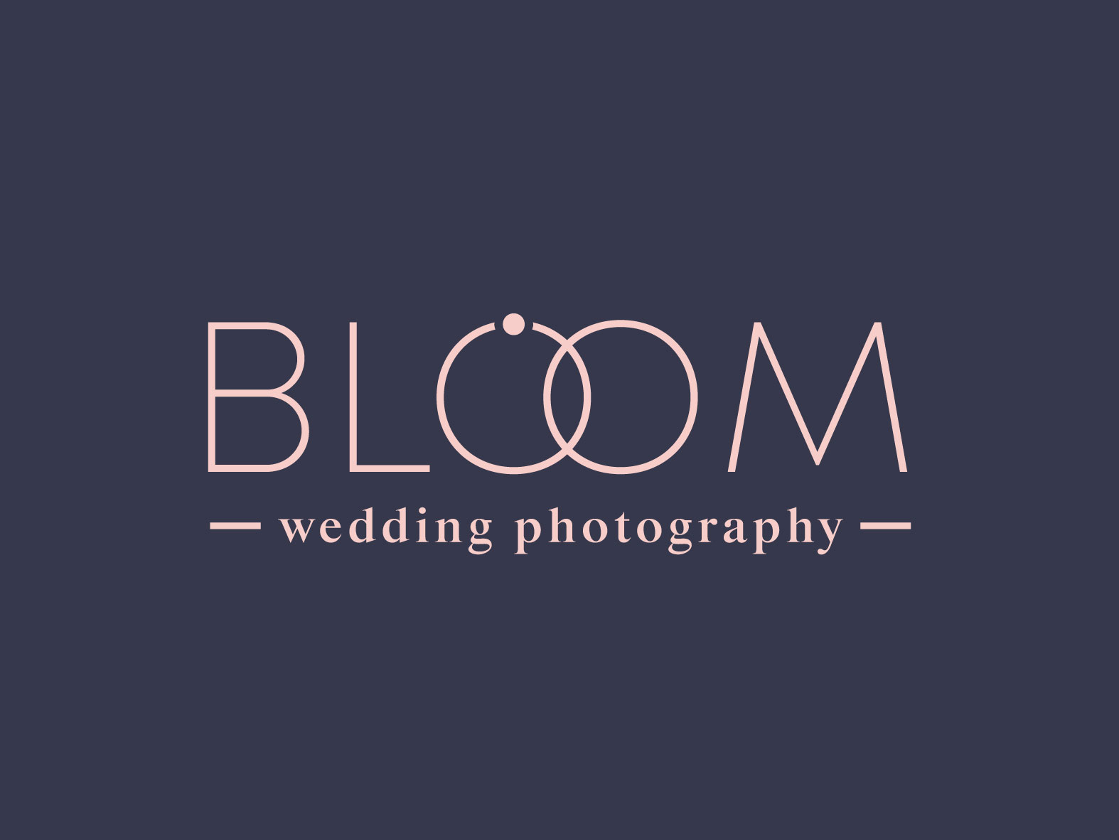
It’s a typographical version of a logo. It’s based on the company’s name. Logotype could include a graphic element as well but as an addition usually composed into the letters. Logotype is a great option for businesses which has a wide range variety of services. It’s represented by the style of the typography. In the example the ‘O’ letters are composed together as a wedding rings. I’ve added the dot to the ‘O’ to represent the engagement ring.
Signature – it’s also a typographical logo, but based on script or handwritten font. It imitates the real signature.
Monogram
It’s a logo based on initials / letter (or letters). The letters are usually used to create a specific composition. The monogram logos could be a very minimal projects but also very elegant and sophisticated. Use monogram to represent a business with a luxury feel or with a wide range of products. The graphical elements can be a part of a letters’ composition. Monogram can be also paired with the company name under it.
Emblem
Emblem is a more complex type of logo. It includes graphical and typographical elements composed together. Usually in the way that you cannot separate them (you can for example separate the symbol and typography from the ‘Fox + Iron’ logo and use it separately, if the brand concepts allow it). It’s kind of a badge style logo. The well known example of an emblem logo is an old Starbucks logo or Harley-Davidson emblem.
Mark
Brand mark logos are usually an effect of a brand evolution. Used mostly by well known brand, who don’t need to display a company name any more to be recognizable. The mark logo is a graphical element stand alone. Example of that is a Twitter bird. The another one is a Starbucks, who got rid of the emblem logo and change it to the siren graphic without any text around it. Brand mark could be good for social media profile image, however I wouldn’t recommend it as a main logo, especially for new businesses, which name is not recognizable yet.
Communication
I hope this short logo types guide help you to understand the differences and you’ve got inspired to work on your own business logo. If you’re still not sure about the logo types terms, don’t hesitate to ask me. After all the communication between the client and the designer are a key to a great satisfying work.
I’m happy to help you create your perfect logo, please check my portfolio and contact me!


