Improve Your Candle Label Look with simple steps

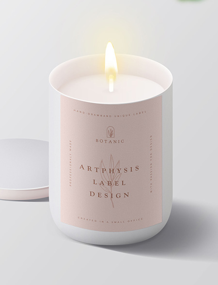
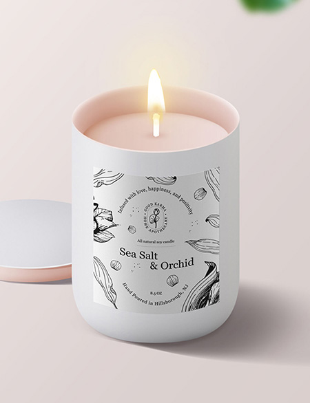
The post discusses some of the most common “mistakes” or, as I prefer to call them, untapped potential in label design. I’ll be sharing examples based on cases I’ve encountered while working with my clients. To help illustrate the points, I’ll be using my own graphics to show you the before-and-after effects, allowing you to see the transformations.


I decided to write about this topic because a significant portion of my clients are small, new businesses. They might not always have the resources for a full graphic design service right from the start, or they prefer a hands-on approach (trust me, I understand that feeling:). My intention is to share my knowledge and insights gained over years of experience, so that you can position yourself right alongside top brands on the business shelf.


Unlike big companies with dedicated marketing teams and designers, these small businesses might not be fully aware of how crucial the visual aspect is. While I firmly believe that the product itself holds immense importance, a strong visual presence and effective marketing are also vital in achieving your brand’s goals.


Rest assured, there are ways to ensure your label looks fantastic. Are you ready to explore some common scenarios?

1. Lack of balance

Finding the right balance is a familiar challenge. Often, the arrangement feels a bit heavier than it should, and the urge to fill every empty spot can be counterproductive. Elements tend to gather in the centre or on one side.


A helpful approach is to aim for harmony in placing your elements. Don’t hesitate to remove what doesn’t seem to fit. Try squinting your eyes and focusing on the label. Can you spot areas with too much empty space, or where there’s an overload of elements? If this feels tricky, opt for simplicity: centre-align or left-align the composition, especially for rectangles or squares. Make sure to leave sufficient space from each edge; it lends the label a polished and clear appearance.


Shall we begin with some common scenarios?

improve candle label look
Elements on the label are not balanced
candle label design
Balanced composition

2. Not enough space from the edges

Making sure there’s ample space along the edges of the label isn’t just about technicalities. It serves a practical purpose too, especially when you’re dealing with printing. Adding around 0.12 inches (approximately 3 mm) to each side is recommended when you’re preparing to print.


The surrounding space actually helps draw attention to the centre of the label. Plus, it’s a major player in keeping the overall design well-balanced. The more space you have, the more upscale the label appears. On the other hand, text too close to the edge might give off the impression of a label that’s been cut incorrectly or a design that wasn’t carefully thought out.

improve candle label
Elements too close to the edges
candle label design
Enough space from the edges

3. Too many fonts

In some projects, you might come across a bunch of different fonts. These can be pretty cool and attention-grabbing, making the designs stand out. But remember, the more fonts you use, the harder it can be to read and understand the project. Try to stick to two fonts. It’s totally okay if they’re not the exact same ones used in the logo. The logo does its own thing, but do try to make sure the fonts match the logo’s style to keep things consistent.

candle lebel design
Too many fonts
how to design a candle label
Enough fonts

4. Not appropriate fonts

When picking the right typography for your brand, think about what vibe you want to give off. Are you aiming for a friendly, modern, or luxurious feel?


Remember, an elegant font doesn’t always mean it has to be all swirly or fancy. For instance, if your brand is all about being modern and eco-conscious, using a cursive font might seem a bit outdated. On the other hand, if your candle business is all about fun and bright colors, a heavy and blocky font might not capture that lively energy you want to convey.


The key is not to go overboard with too many font choices. Stick to a pair: one for headings and another for regular text. And of course, keep in mind that whatever you choose, the text should be easy to read.


A clever approach could be combining a more “elegant” font for headings with a simpler (like a sans-serif) option for the main text. This way, you strike a great balance.

candle label design
Poor font choice
Choosing fonts for a label
Better font choice

5. Non readable text

Like we talked about earlier, making sure your label text is easy to read is key. When you’re adding text to your labels to share information, the font’s size and style really matter. It might be helpful to print a label in its actual size at home, if you can, just to see how the font appears in real life. Certain fonts still look good at 5 points in size, but others might be too tiny to work well in print. Occasionally, the printing place might even suggest a minimum font size for clarity.

candle label design
Too small font
how to design candle label
Font size readable in print

6. Too many Details

One of my favourite design principles is ‘Less is more’ because it consistently delivers great results.


This doesn’t necessarily mean you have to go super minimal, but it’s valuable to think about what’s essential to include on your label. While certain details are necessary for selling candles, consider where you can position these labels smartly (for instance, technical info could be placed at the bottom of the container). What does the customer really want to see? Maybe just the scent name, key scent notes, or a brief description of the fragrance? You don’t have to include every detail about being vegan, cruelty-free, gluten-free, plant-based, organic, etc.


Select a few to show your commitment to the environment, but avoid overcrowding your label with too many badges. Remember, candle labels are usually small, so balance is key.”

how to design a label
Too many details
candle label design
Enough details

7. Label size don't match the vessel size

Normally, the label ends up being too large. Remember to leave some space at the top and bottom.


If the label is too small, it might make the jar look crowded. But if you have beautiful and elegant jars, hiding them with a big label would be a big missed opportunity. Those good-looking jars are actually a positive thing for you.

too big label on the jar
Too big label
Botanical label design
Good label size

8. Poor paper and print quality

When you’re beginning your journey, there’s a bunch to consider investing in. Don’t leave packaging or labels as the very last thing on your mind. Good quality, sturdy paper, and clear, sharp printing are the essentials. You don’t have to choose the priciest option, such as embossing (although I do suggest it if it fits your brand style). Just make sure the paper stays intact and doesn’t fold easily, and that the ink stays put without smudging. It’s all about getting the basics right!

Conclusion

I’m glad to share these tips for enhancing the look of your candle labels. I hope they’ll guide you in creating the perfect style for your brand. If you find that you could use more assistance with the design, please feel free to get in touch. I’d be delighted to craft something special just for you, allowing you to concentrate on making your wonderful products.