

Understanding Letter Spacing and Best Practices in Canva
Letter Spacing Explained:
Letter spacing, also known as tracking, refers to the adjustment of space between characters in a text. It allows designers to control the overall density of the text by increasing or decreasing the space between letters. Properly adjusting letter spacing can enhance readability, improve visual aesthetics, and contribute to the overall balance of a design.

How to Use Letter Spacing in Canva:
Canva provides an easy-to-use interface for adjusting letter spacing in your designs. Here’s how you can use letter spacing in Canva:
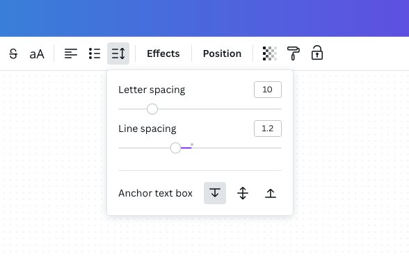
- Select the Text Element: Start by selecting the text element in your Canva design that you want to modify. Click on the text box or select the text itself.
- Access the Letter Spacing Tool: In the top menu bar, you’ll find the “Typography” options. Look for the “Spacing” dropdown menu, and within that, you’ll see the “Letter spacing” slider.
- Adjust Letter Spacing: Slide the letter spacing control left or right to decrease or increase the space between letters. As you move the slider, you’ll see real-time changes in your text.
- Fine-Tune with Precision: For more precise adjustments, you can manually input a specific letter spacing value in the provided numeric box next to the slider.
- Apply Consistently: If you have multiple text elements in your design, make sure to apply consistent letter spacing to maintain a cohesive look.
Best Practices for Letter Spacing in Canva:
- Avoid Excessive Spacing in Script and Calligraphic Fonts: Script and calligraphic fonts often have intricate connections between letters, and excessive letter spacing can disrupt the fluidity and elegance of these fonts. It’s generally recommended to avoid significant spacing adjustments for scripts to preserve the intended visual style.
- Consider Readability: Be mindful of how letter spacing affects readability. Too tight or too loose letter spacing can make text difficult to read. Ensure that your chosen spacing enhances, rather than hinders, the legibility of the text.
- Maintain Consistency: Consistency is key in design. When using letter spacing for headings, subheadings, or body text, aim for a consistent look throughout your design. This creates a cohesive and professional appearance.
- Test Across Devices: Design elements can look different on various devices and screen sizes. Test your design with different letter spacing settings to ensure a visually appealing and readable outcome across platforms.
- Consider Branding Guidelines: If you’re working on a design for a brand, consider any existing branding guidelines. Some brands may have specific recommendations regarding letter spacing to maintain a consistent visual identity.
Summary
By understanding the basics of letter spacing and following these best practices, you can use this design element effectively in Canva to create visually appealing and readable text elements in your projects.
Follow me on Instagram for more tips on branding and to see my recent work!