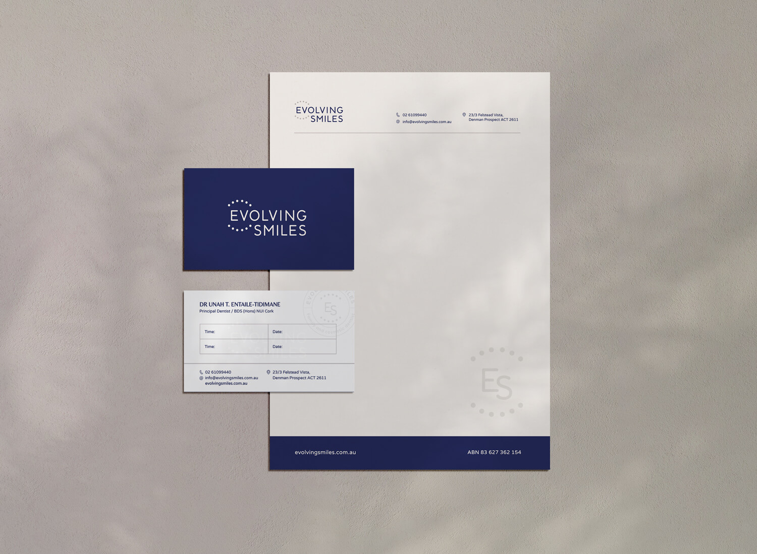
Evolving Smiles
Brand identity for a luxurious dental clinic
What they needed
A complex brand that relates to the business owner and the character of the clinic.
The challenge
Evolving Smiles is a luxury dental clinic. They’d changed their logo a few times and still weren’t happy with the result. The problem was a lack of visual strategy, as there was no brand strategy. When they completed the brand strategy questionnaire, I found their ideal client persona wasn’t defined and they didn’t have a competitor profile.
How I helped
The clinic offers high-end services and wants to be seen as a friendly, luxury clinic. The client’s brief showed they have a professional and skilled team. They also have a friendly and welcoming approach for their clients. As it’s a family dentist I didn’t want to use anything ‘sharp’ or too serious in their brand identity.
I researched competitors in Canberra, Australia, where Evolving Smiles is based. Many use a single tooth symbol or typography as a logo. I researched high-end dental services and found many don’t have a luxury feel. The concept for their logo is a top and bottom row of teeth. A simple, minimalistic design keeps the brand looking high-end and a smooth, slightly rounded font gives it a friendly character.
The result
- Consistent brand identity across marketing materials.
- Branding that represents the character of the clinic.
- Clear internal branding for mission vision and creating customer profiles
I had an excellent experience working Joanna. She was very professional, efficient, understood my brief and helped me through the design elements of my branding and logo. She took on feedback and produced what I had in mind for my branding but couldn’t quite articulate on paper. Definitely recommend her.
Dr Unah, Evolving Smiles
