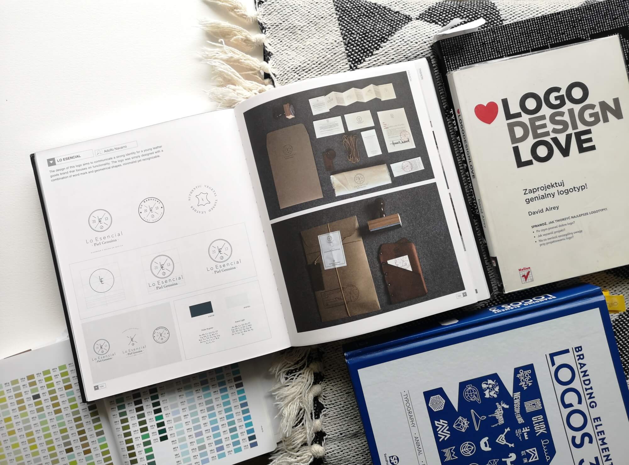
5 crucial mistakes to avoid when designing a logo
Logo is a part of brand identity that represents your company. There are many types of logo you can create or ask someone to design it for you. The crucial thing is to make it meaningful and simple.

1 / Logo idea based on assumption
Sometimes you base your idea on what it may be a good representation for your business, without going deeper into it. Start with your brand strategy and competitors research, then create visual identity, including the logo.

2 / Copy your competition
You might be inspired by some brands, that are aspirational, however, what you want to do is make yourself different on the market, not the same! Fill that gap on the market!
3 / Using pre-made logos
I believe, it’s better to go with the company name written in nice font, if you don’t have a budget, than using the same logo as many people. I’m not totally against it, but be careful with the copyrights. These are not covered by many pre-made logos platforms.
4 / Too complicated
Gradients, flowers, too many fonts or portraits of yourself are not a good idea for a logo.
Why keeping it simple? To make it easy to remember and recognize. Simple doesn’t mean boring. You can have super decorative patterns, art or busy, dynamic photos, but grab the essence of it in a minimal way.

5 / Unique but not meaningful
These are important factors of a brand itself, but I would put meaningful above unique. The reason is you can have a simple font based logo and as long, as it represents your values and business, it will work well! Unique (as I love this aspect so much), it’s not the most essential factor of the logo. Focus on your difference points and what makes you unique as a whole brand.